
Anecdotal, but my iOS App got approved much faster with new assets!
For the past few months, getting a new iOS app reviewed has been taking me about a month. It used to take a few days. Today, a submission with one of Apple's new image assets sailed through in two days.
That's a big enough difference to get my attention. It's also one submission. I don't know whether the image helped, whether the queue got shorter, or whether I just got lucky. But after months of waiting, I wanted to show what changed.
The wait has become hard to plan around
A few days is a delay you can work around. A month makes it hard to decide when to tell anyone your app exists. You can finish the work on your side and still have no useful answer to “when can I download it?”
Other developers have been describing similar waits on Apple's forums. In September, the developer of Ping Pong Connect reported that its first submission had spent 14 days in Waiting for Review without entering In Review. An October thread describes an update still waiting more than two weeks after its first submission, including a resubmission. Those are individual reports, not a measurement of the whole queue, but the frustration is familiar.
Apple's current review-status guidance sets a goal of reviewing at least 50% of submissions in under 24 hours and 90% in under 48 hours. It also says minor updates and bug fixes typically move quickly. That overall target doesn't tell me how long a new app will wait, which is the number I've been struggling with.
The new Header and Search Results tab
Apple's October 5 App Store Connect update introduced creative assets for product page headers, search results, and other placements, along with an Asset Library. On the version page, under Product Page Information, there's now a Header and Search Results tab beside the usual app previews and screenshots.
Here are the two placements for Wristful Thinking, combined from my App Store Connect screenshots. The wide image is the product page header; the taller one is the search-result creative. You can open the image to inspect the full-size comparison.
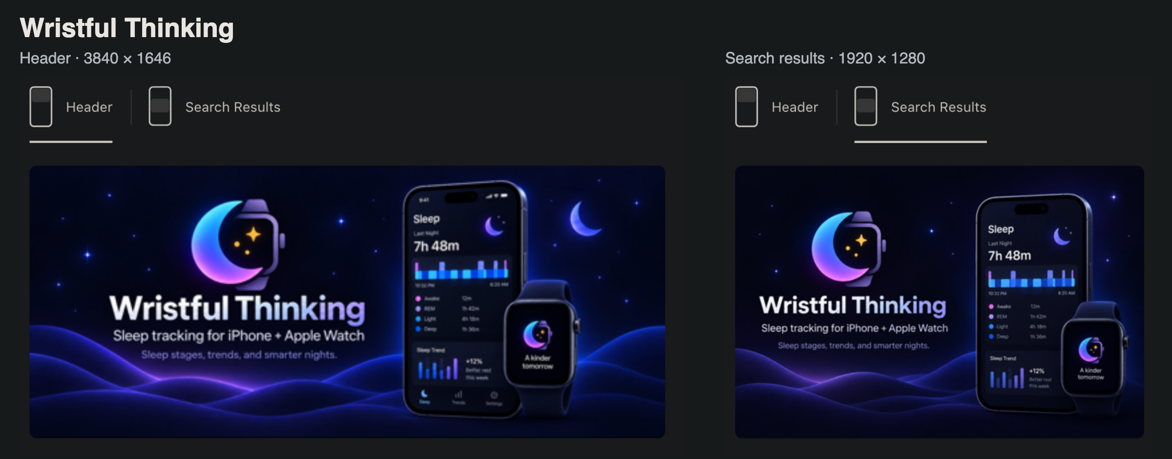
These are optional creative assets, separate from the screenshots that show the app in use. Apple lets you submit them with an app version or independently through Asset Library. The placements are available on iOS 27 and iPadOS 27 or later. Nothing in that workflow promises a faster app review.
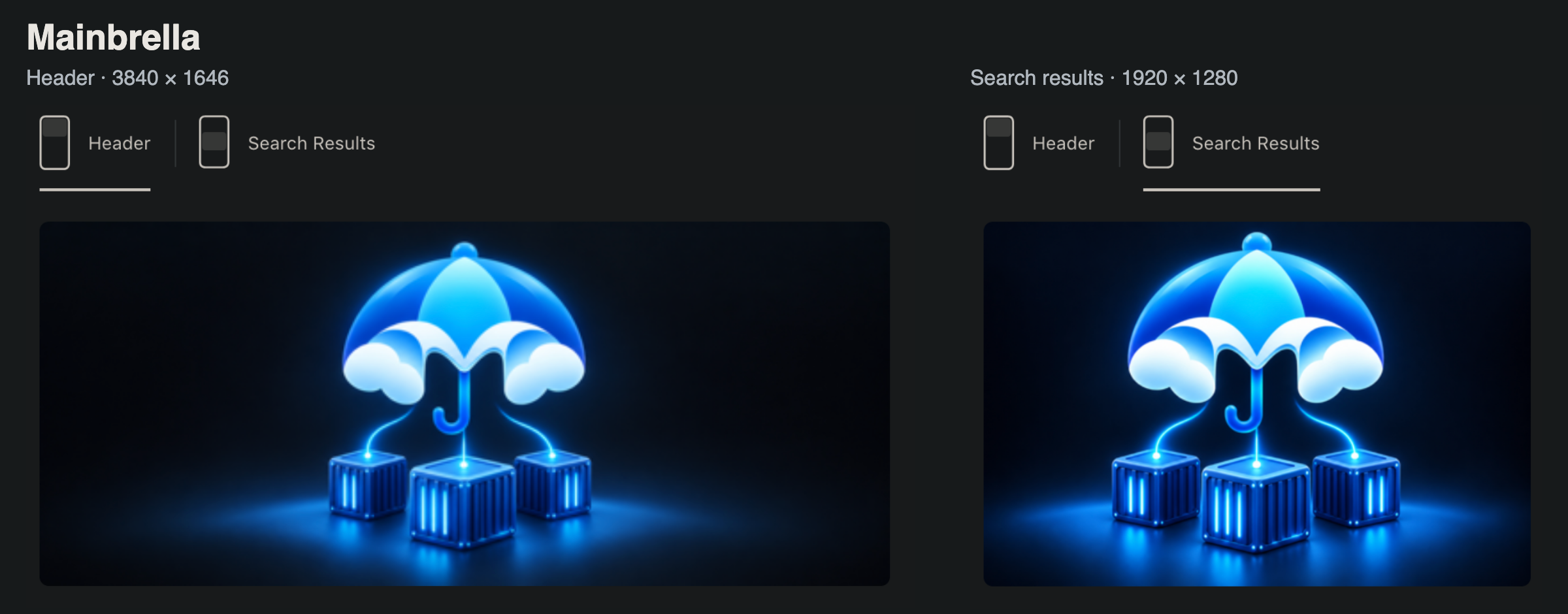
Mainbrella uses the same two slots. The umbrella and containers stay recognizable in both shapes, with more room around them in the wide header. The screenshots here show the asset setup while the apps were still in review or waiting for review; they don't establish the approval time.
Two sizes I added to my image skill
I now have these instructions in my image-generation skill, so the dimensions are there the next time I need them:
- When asked for an iOS header image, make a PNG at 3840 × 1646px.
- When asked for an iOS search result, make a PNG at 1920 × 1280px.
Those match Apple's dedicated image specifications: 3840 × 1646 for the header, and a 3:2 search image from 1920 × 1280 up to 3840 × 2560. Apple accepts PNG or JPEG for these sizes and says images can't have transparency. The two PNG sizes above are the ones I've chosen to use.
The upload is under your app's version → Product Page Information → Header and Search Results. Choose Header or Search Results, upload the corresponding asset, and use Preview to check the placement before submitting.
I'll include these assets in future submissions because I want the listing to have them anyway. If the next new app is back to a month, that'll be useful to know too. Has anyone else added the new creative assets and seen their review time change?